
Digital Dashboard Design For Canomiks

Digital Mockup By Jessica Huynh

Project Summary
Canomiks is a new tech start up working to test functional ingredients, such as CBD & turmeric, for genetic efficacy. Basically, they are illuminating how these biological ingredients interact with an individual's unique genetic makeup.
Canomiks was founded by a team of world-leading academics and scientists with over 50 years of combined experience in the fields of bioinformatics, genomics, clinical science, and pharmacology. I had the opportunity to work on a team and propose the design of a new digital dashboard for customers & administrators to use for communication, contract tracking, status submission, and record keeping.
Our Solution?
We created a multi-user dashboard prototype for Canomiks. This dashboard demonstrated both the front-end and back-end user experience and aimed to alleviate the same archaic redundancies that plague labs throughout the industry. We wanted to increase visibility for all users across the board.
Research
Competitive Analysis
Kano Survey
Remote Concept Evaluations
Remote Usability Tests
Deliverables
User Journey Map (Current and Future State)
Information Architecture Diagram
Interactive High-Fidelity Prototype
My role
Initially I focused on the Kano survey and analysis to make sure we had a user backed direction for our ground up MVP build of the dashboard.
From there, I moderated 2 key concept evaluations. One evaluation led me into a deep dive into dynamic watermarking and its role into aiding the security and integrity of Canomik’s test results. We included this design as a part of the client handoff.
As the group built out our prototype, I switched gears and took on the script writing for our team’s keynote presentation.
Users
Suppliers who want their products tested and verified for content, safety, efficacy, potency, and more.
Marketers who want to sell products with ingredients that are tested and verified so they can attract and connect with customers with science-based, technology-driven insights.
Lab personnel who want to manage their workflows and have access to all of the information they may need easily and quickly.
Canomiks administrators who want to develop relationships with clients, as well as manage accounts & billing with ease and simplicity.
Methods
Client Kick Off Meeting
Competitive Analysis
Remote Usability Evaluations
Remote Concept Evaluations
Kano Analysis
User Journey Mapping
Information Architecture
Tools
Figma
Sketch
Google Forms
Pen & Paper
Keynote
Zoom
User Interviews
To really wrap our heads around the scope of this problem space, we conducted a series of user interviews with users from various touchpoints of the proposed digital dashboard. I moderated a few key sessions that led to critical user insights which informed the group’s direction.


Dashboard Feature Ideation
With base level understanding of the user’s problem space and Canomiks expectations of our solution, as a team we drew up potential features for our dashboard.

AI Chat

Autosave Progress

Contract Progress Tracking
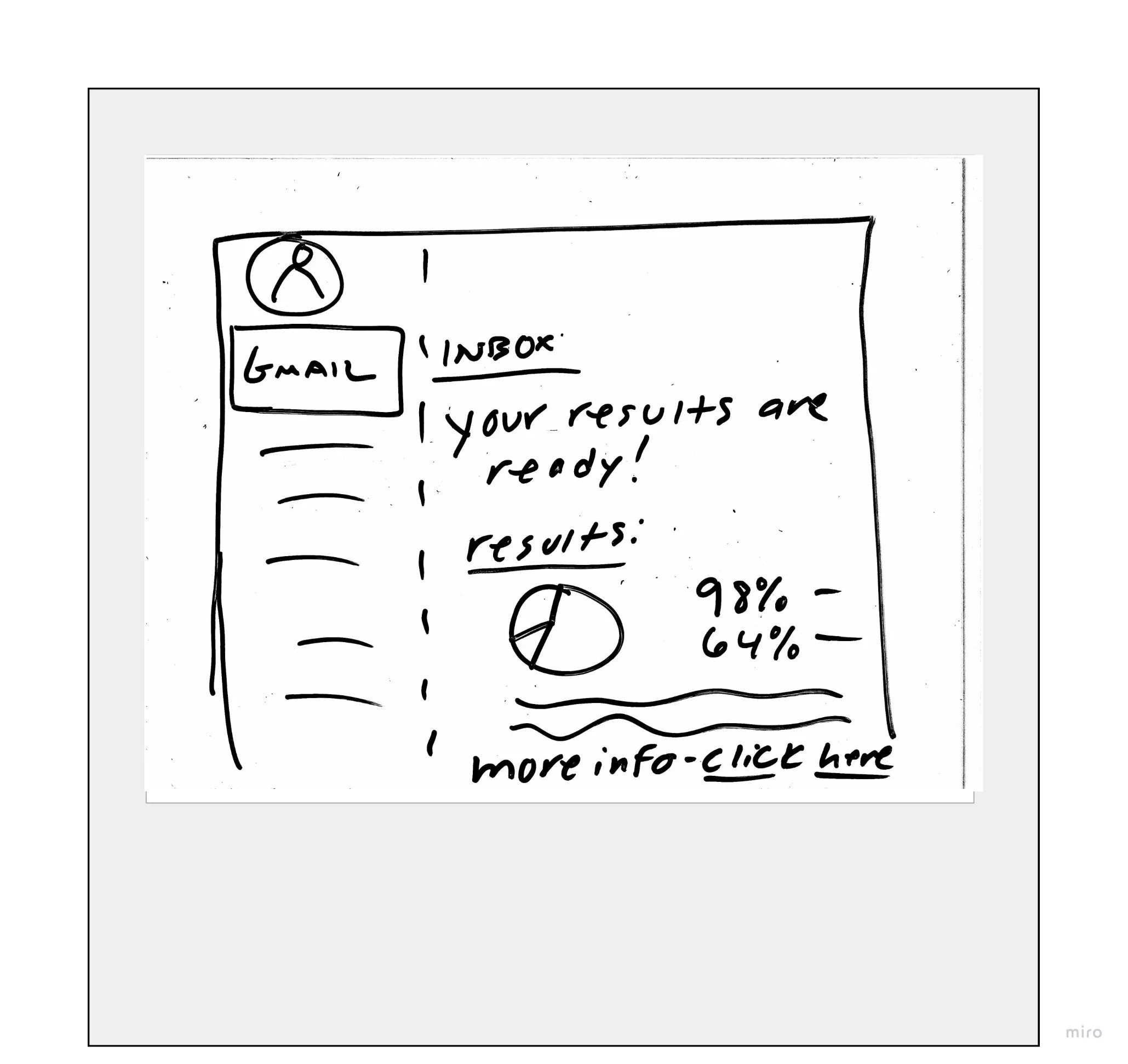
Email Notifications

Similar Ingredients Matching

Test Sample Progress Tracker w/ Notifications

Sample Tracking
User feedback on our features.
We set out to understand how these features would add value and usability to our proposed dashboard. To do so, we employed a Kano Survey through Google Forms. What we found was that the majority of our ideas were desired and in fact deemed essential for users satisfaction with our dashboard. Autosave, notifications and transparent tracking of both samples and contracts being absolute deal breakers.
Kano Survey Results

A small sampling of our user survey results.

The red bar represents how satisfied a user will be if a feature is present and the blue bar is a measure of how dissatisfied they will be if it’s absent.

Feature data analysis in Google Sheets.

Dashboard Information Architecture

My teammate Emily Garber spearheaded our dashboard’s Information Architecture Diagram. It was instrumental in achieving an efficient design system for our digital dashboard.

Mapping out the user’s present and potential journey.

Current State Journey Map

Future State User Journey Map
My teammates Gabrielle Bajuscik and Heather Scheil took on the creation of these handy Current and Future State User Journey Maps. As a team, we synthesized the data from our user interviews through infinity diagramming on Miro. As patterns emerged we used them for empathy building and identifying opportunity areas for which our dashboard could better address the pain points and redundancies that exist in the current state of testing for Canomiks and their clients.
Now that we had features sketched, their purposes backed by research, and a style guide in place, we took to Figma as a team and built up a high fidelity interactive prototype to present to Canomiks.

Keynote Presentation
I took on the initial sculpting of this script and together with my team we designed an engaging 14 minute remote keynote presentation for our stakeholder.
A fun design challenge was diluting this science heavy client and their goals down to a palatable script for the more generalized audience in attendance. Through multiple iterations, we worked together to achieve this goal.

Next steps.
Our first step would be to run our interactive prototype through some remote usability testing to ensure it’s basic usability. And get some feedback as to where the source of any user confusion is coming from.
Also! Canomiks hopes to launch a dashboard within 6 months of this case study, and it’s a thrill to see my work contribute meaningful user sourced recommendations that they can use in their launch.